
PHOTONICA
Hard to top Photonica: (http:) Print Ads
These print ads were developed as part of a campaign to promote Photonica’s then new Website. Stock Photography had heretofore been the provenance of catalog distribution. The headline “Hard to top Photonica” was a subtle nod to the letters that begin any and all web addresses… http:
ROLE: Creative Direction, Design, Writing

PHOTONICA
“If Stock Photography is a picture of a guy and a girl on a beach. Photonica is what it FEELS like to be the guy and the girl on the beach.”
In other words, Photonica was known for it’s artful and emotional image content. With that in mind, while at Photonica, I lead the charge to develop a more commercially accessible sister brand: AKA. (As in, Also Known As… AKA Photonica)
Seen here is the identity system and the first AKA book. The book was called “SPANNER” a reference both to the utility of the collection (Spanner is the English term for wrench) and also the breadth of the work as well.
ROLE: Creative Direction, Design, Writing

PHOTONICA
“How to be Yourself” Print promotion
ROLE: Creative Direction, Design
PHOTONICA
“How to be Yourself” Print promotion
ROLE: Creative Direction, Design
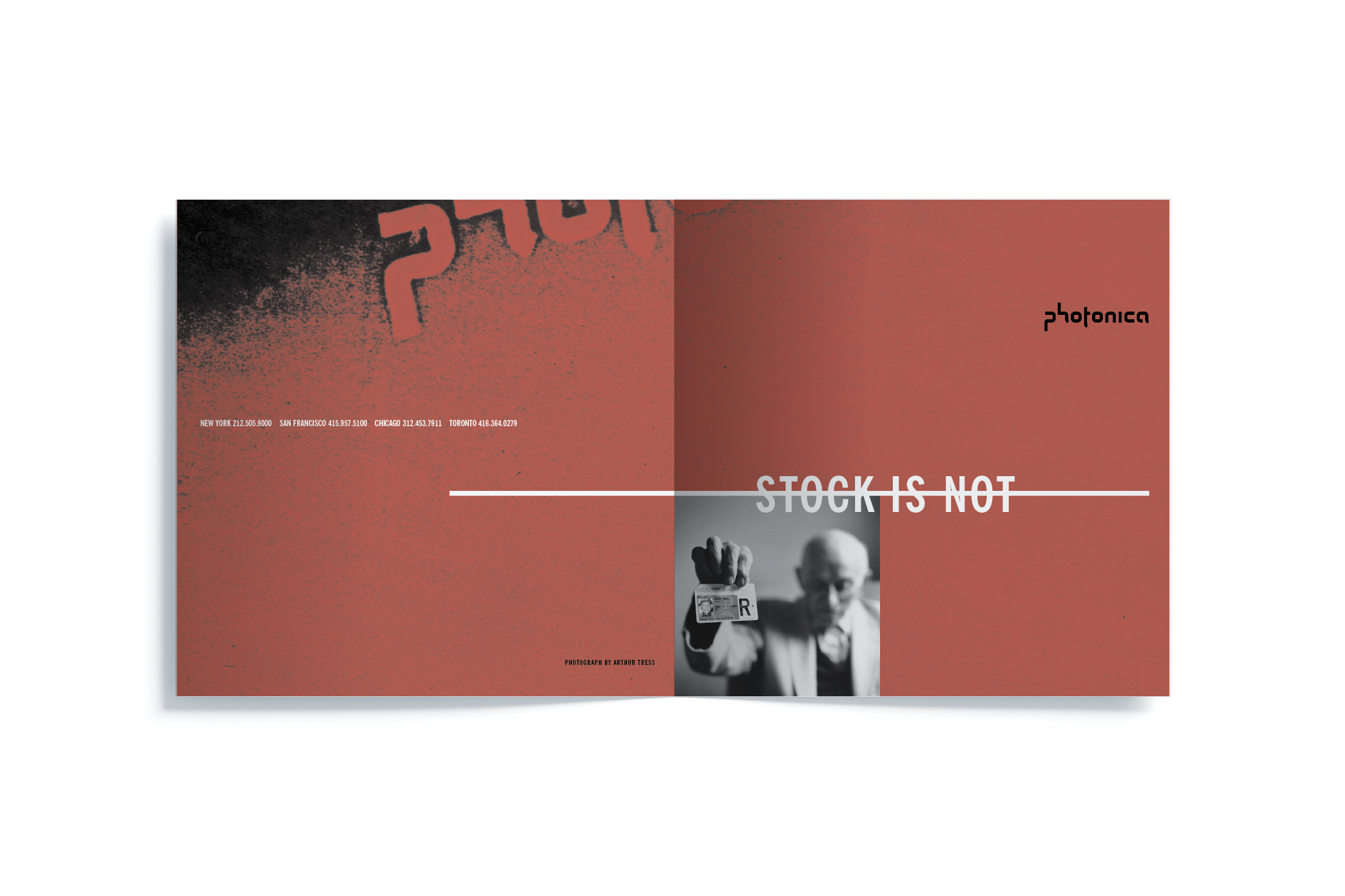
PHOTONICA
Promotional Print
PHOTONICA
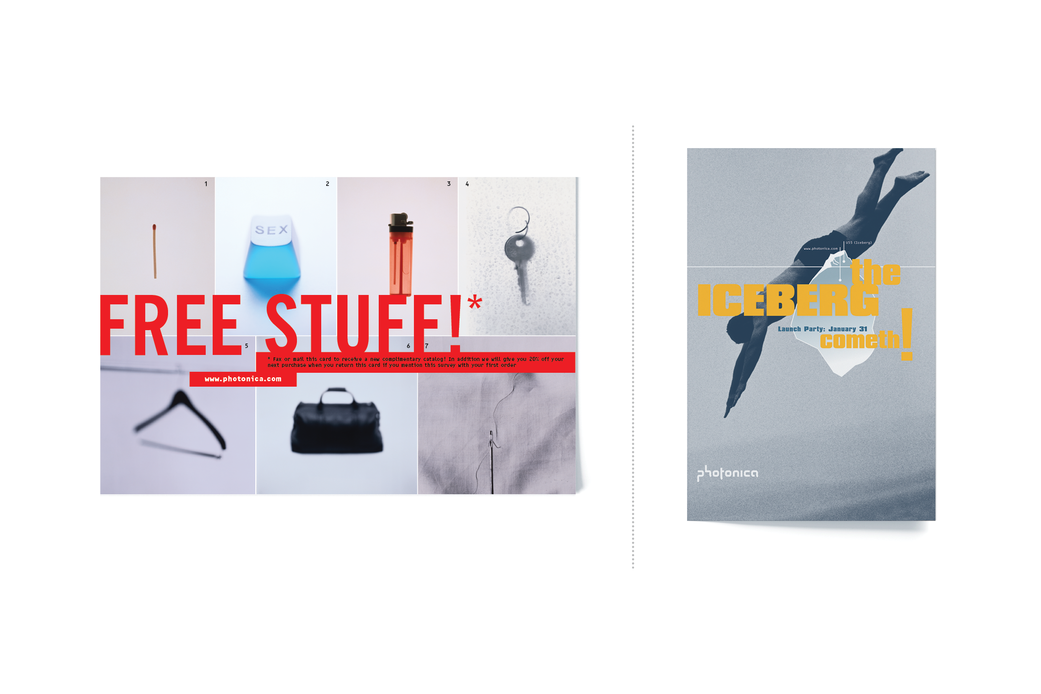
Edition 55 “Iceberg”
As I had curated and designed the first printed catalog for the Western Market, it seemed only fitting that I would be involved in creating the last one as well. Edition 55, named ICEBERG – a reference to the infinitely larger collection of images available online – was conceived as a print companion to the ever multiplying web collection.
ROLE: Concept, Creative Direction, Design, Writing

PHOTONICA
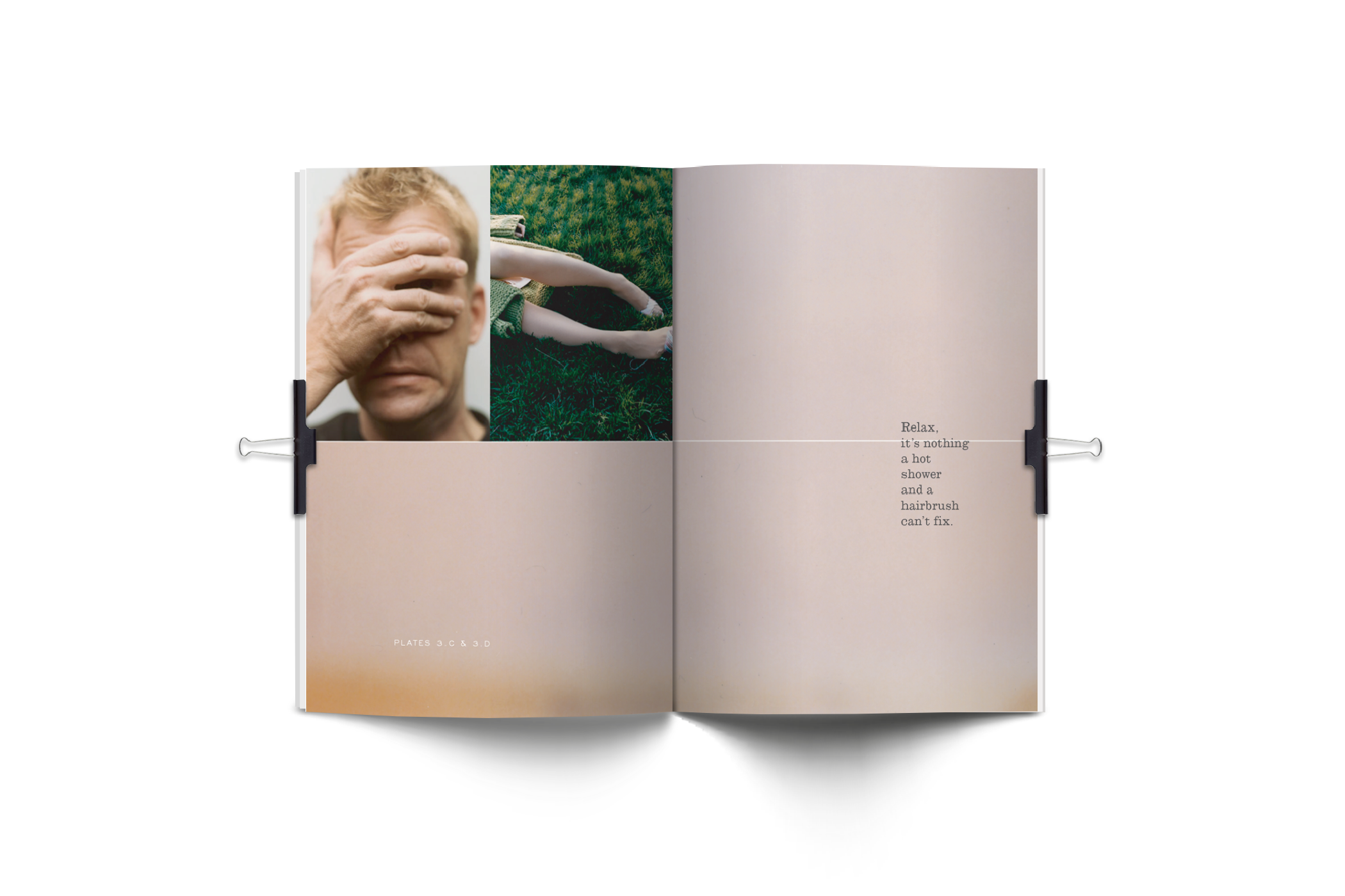
.txt – Volumes 1 & 2
As digital distribution took hold at Photonica, it became clear that customers missed the joy of the printed page. So we developed “.txt” as a “Web companion.” Each volume was a different shape and size and endeavored to bring back some of the tactile experience so familiar to those raised on print medium.
Additionally, we aimed to bring additional visual food for thought to each piece by also featuring non-photographic artists as well. Seen here (from Vol. 2) was the illustration of Toronto based artist, Derrick Hodgson.
ROLE: Creative Direction, Writing
PHOTONICA